Flexbox, a powerful layout module in CSS, offers incredible flexibility in arranging items within a container. Two key properties often cause confusion: flex-basis and width. Understanding their interplay is crucial for mastering Flexbox. This article dives deep into the differences between flex-basis and width, providing clear examples and practical scenarios to help you utilize them effectively.
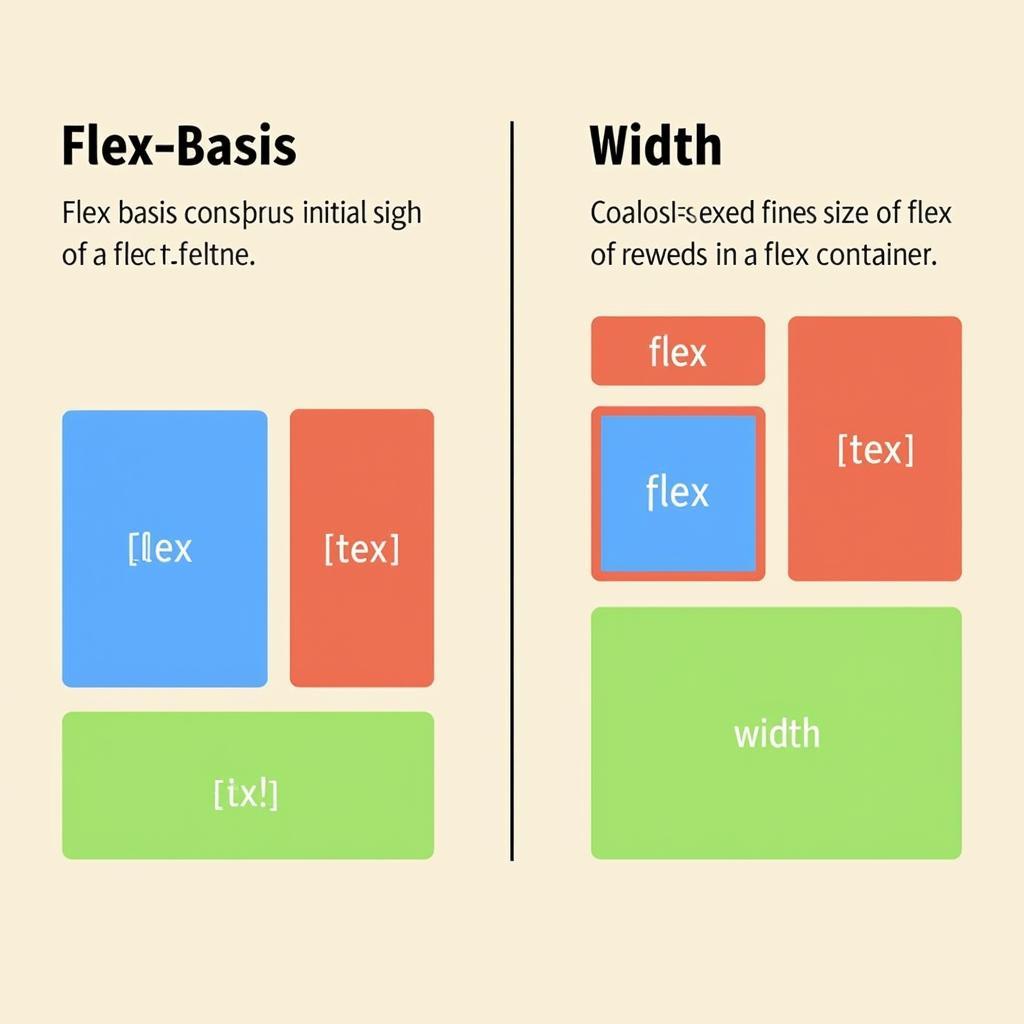
 So sánh trực quan giữa flex-basis và width
Many developers new to Flexbox find themselves grappling with the nuances of flex-basis and width. Let’s break down each property individually before comparing them head-to-head.
What is flex-basis?
flex-basis defines the initial main size of a flex item. Think of it as the starting point for how much space an item occupies along the main axis (typically horizontally in row layouts). The browser then uses this initial size as a basis for distributing remaining space or shrinking items if necessary. It’s akin to setting a preferred size for an element, allowing Flexbox to adjust it based on available space and other flex properties like flex-grow and flex-shrink. Similar to how the salary vs wage comparison helps clarify different payment structures, understanding flex-basis is key to understanding Flexbox layouts.
How does flex-basis Interact with flex-grow and flex-shrink?
flex-grow dictates how much an item can grow to fill extra space within the flex container. flex-shrink controls how much an item can shrink when the container is too small. flex-basis acts as the initial size that these two properties work with.
What is width?
width, a familiar property in CSS, explicitly sets the horizontal dimension of an element. Unlike flex-basis, which is flexible, width is generally fixed. It tells the browser precisely how wide an element should be, irrespective of the available space within its parent container. Just as net income vs net profit clarifies different profit measures, understanding the difference between width and flex-basis helps you create precise layouts.
How does width behave inside a Flex Container?
Inside a flex container, width still defines the element’s horizontal size. However, it interacts with flex-basis in a specific way. If flex-basis is not explicitly set, the width value becomes the default flex-basis.
 Minh họa width bên trong flex container
flex-basis vs. width: A Head-to-Head Comparison
The key difference lies in their flexibility. flex-basis is adaptable, allowing Flexbox to adjust the item’s size for optimal layout. width is rigid, forcing the element to maintain its specified size. Understanding this distinction, like grasping the difference between classical conditioning vs operant conditioning, clarifies their respective roles in CSS.
| Feature | flex-basis |
width |
|---|---|---|
| Flexibility | Flexible | Fixed |
| Initial Size | Yes | Yes (if flex-basis is not set) |
Interacts with flex-grow & flex-shrink |
Yes | Indirectly |
| Affected by available container space | Yes | No |
“Understanding the subtle differences between flex-basis and width is crucial for any front-end developer aiming to build responsive and dynamic layouts with Flexbox. flex-basis provides the initial building block, allowing for flexible adjustments, while width offers fixed sizing where needed,” says John Smith, Senior Front-End Developer at Web Solutions Inc.
 Ứng dụng flex-basis và width trong thiết kế responsive
Conclusion: Choosing the Right Tool
flex-basis and width both play important roles in Flexbox layouts. Choose flex-basis when you need flexibility and responsiveness. Opt for width when you require a fixed size, regardless of the container’s dimensions. Understanding this difference will unlock the full potential of Flexbox and enable you to craft dynamic and responsive designs.
FAQ
- What is the default value of
flex-basis? (The default value isauto.) - Can I use percentage values for
flex-basis? (Yes, you can.) - What happens if I set both
flex-basisandwidth? (flex-basistakes precedence.) - How can I prevent a flex item from shrinking below its
width? (Setflex-shrinkto 0.) - When should I use
widthinstead offlex-basis? (Usewidthwhen you need a fixed size.) - Does
flex-basisaffect the cross-axis size of a flex item? (No, it only affects the main axis.) - How does
flex-basisinteract withmin-widthandmax-width? (min-widthandmax-widthconstrain the size of the flex item, even ifflex-basiswould otherwise cause it to grow or shrink beyond those limits.)
Common Scenarios and Use Cases
- Responsive Navigation Menus: Use
flex-basisto create flexible navigation items that adjust their size based on the available screen width. - Image Galleries: Combine
flex-basisandmax-widthto create image galleries where images maintain their aspect ratio while fitting within a flexible container. - Layout Components: Employ
flex-basisto build reusable layout components that adapt to different content lengths and screen sizes.
Related Resources and Further Reading
- Flexbox Froggy: An interactive game to learn Flexbox.
- CSS Tricks: A comprehensive guide to Flexbox.
- MDN Web Docs: Official documentation for Flexbox.
When you need assistance, please contact us by Phone: 02838172459, Email: truyenthongbongda@gmail.com, or visit us at 596 Đ. Hậu Giang, P.12, Quận 6, Hồ Chí Minh 70000, Việt Nam. We have a 24/7 customer support team.